Product Engineering Lab
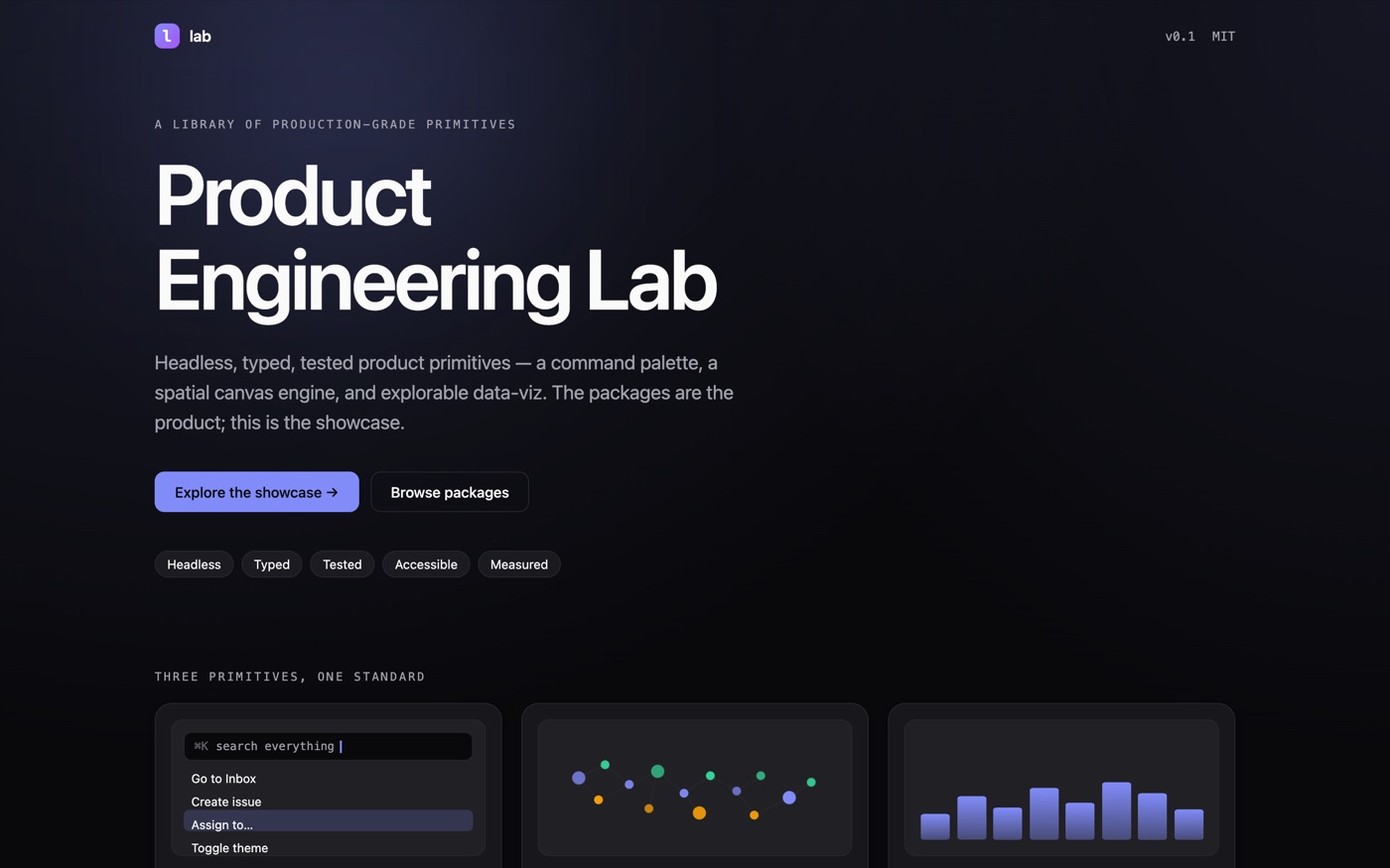
Three interface primitives — a command palette, a spatial canvas, explorable charts — built to be imported by a stranger, not demoed.
The problem
Most component playgrounds are a drawer of unrelated widgets: each one demonstrates that something can be rendered, none of them is something you would actually install. I wanted the opposite — a small set of primitives that share a design system, a build pipeline and a standard, where the package is the deliverable and the showcase is just how you look at it.
The constraints
Four rules, set before any code and applied to every package. Headless first, so the logic lives in pure functions and hooks and the presentation is swappable. A stated performance budget, proved rather than asserted. Accessibility as a requirement, not a later pass. And a written case study for each primitive explaining the one interesting trade-off it makes.
What I built
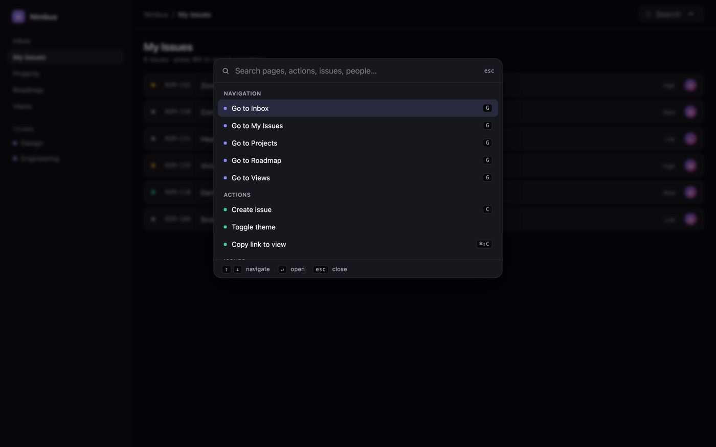
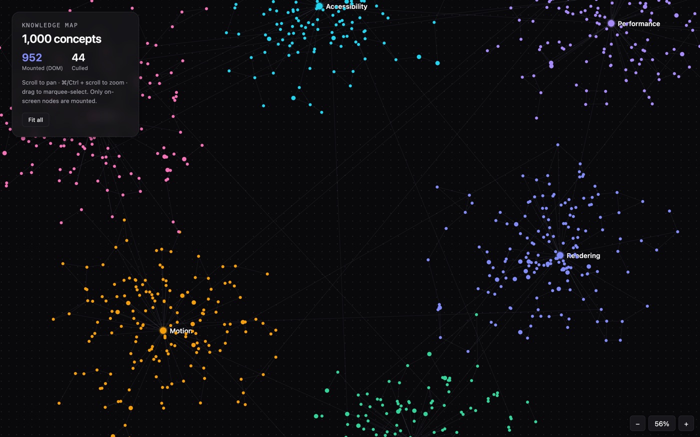
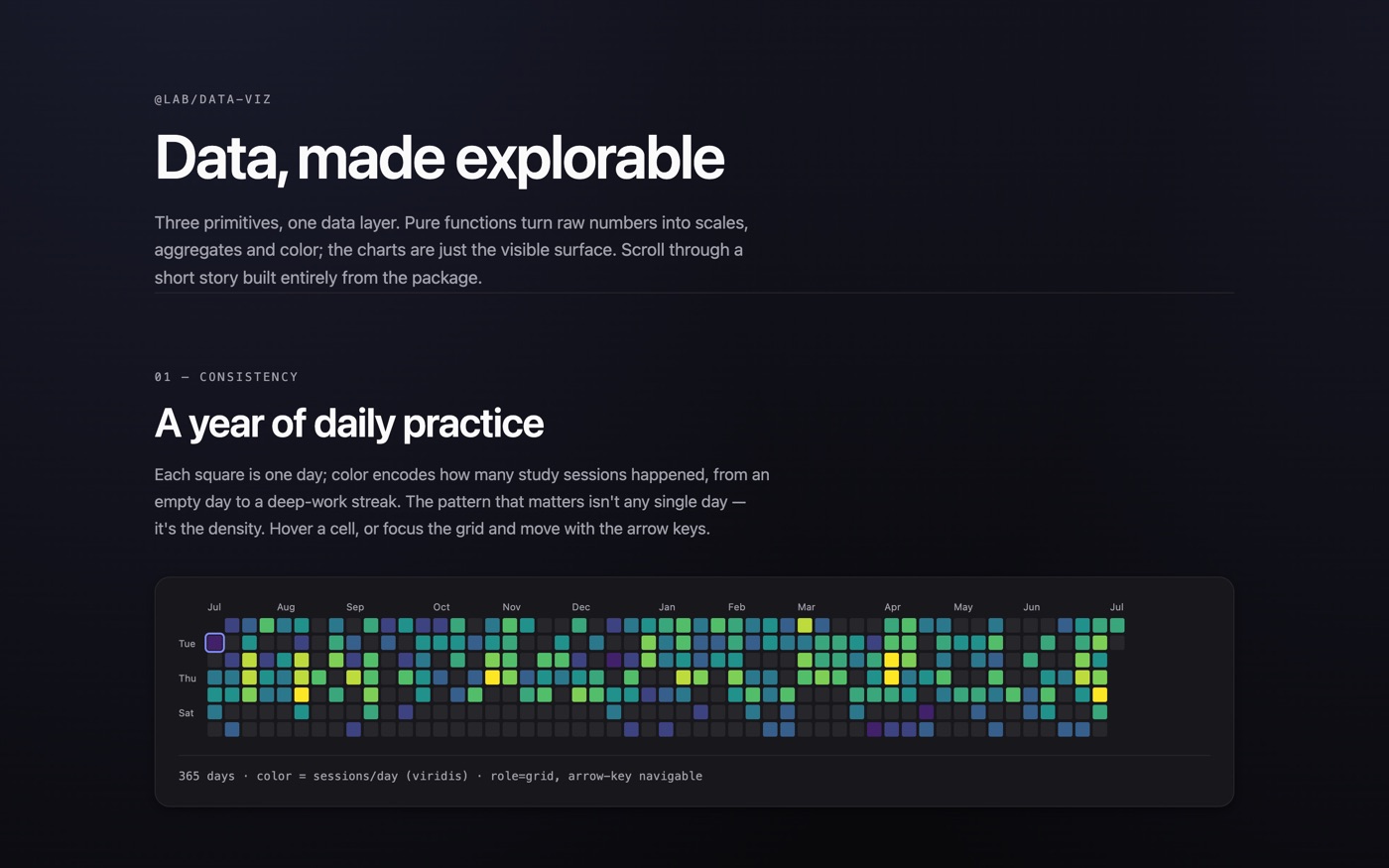
Three primitives and the design tokens that connect them. A command palette with typed async providers, shown driving a fake issue tracker so you can see a real product respond rather than a widget in isolation. A spatial canvas engine handling pan, zoom-toward-cursor, marquee selection and culling, with a live counter showing how many of a thousand nodes are genuinely mounted. And a set of explorable data-viz primitives — an activity heatmap, a zoomable timeline, and a brushable scatter of 290 Swedish municipalities.
Every package has the same three layers: a pure core with no React, hooks that own state and input, components that render.
The result
Three primitives finished and two more designed but not built — listed as planned rather than quietly implied. 211 tests across the workspace, none of them snapshots, and every component suite runs an accessibility check over its own rendered output.
Technical notes
For anyone who wants the detail.
The test suite has two layers. Pure cores — fuzzy ranking, zoom-to-cursor maths, scales, hit-test geometry — are tested as plain functions. Components are driven through real input, with assertions going through accessible roles and names, so a test fails when the user-visible contract breaks rather than when markup is refactored.
jsdom has no layout engine, no ResizeObserver and no PointerEvent, which normally means charts silently render at zero width and the tests pass anyway. A shared test package installs shims that report a real box and let a test change it, so responsive behaviour and culling are genuinely exercised.
Packages build through tsup to ESM plus type declarations, with a "use client" banner so they drop straight into a Next.js server tree. Storybook aliases the packages to their source rather than their build output — a choice I A/B tested rather than assumed, and documented in the README along with what it costs.